

Choosing the right wall colors for your home can transform the entire atmosphere of a room. Colors have the power to affect mood, perception of space, and even energy levels. A well-thought-out color combination can make a small room feel larger, a dark room feel brighter, or a living space feel cozy and inviting. With the vast range of paint colors available today, selecting the perfect pair or trio of colors can feel overwhelming. However, knowing some classic combinations and understanding how colors interact with each other can simplify the process and give your home a harmonious look.

When planning a wall color scheme, it is essential to consider factors like natural light, room size, furniture, flooring, and the overall theme of your home. Soft neutral tones can provide a serene and versatile backdrop, while bold colors can add vibrancy and personality. Combining contrasting or complementary colors can create dynamic effects, but harmony is key to avoid overwhelming the senses. This guide explores ten wall color combination ideas that are timeless, stylish, and adaptable to different rooms and tastes. Each suggestion includes practical tips for application, creating a cohesive look, and enhancing the aesthetic appeal of your space.
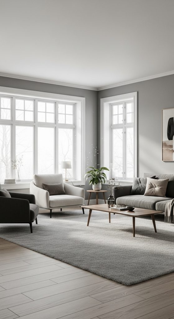
1. Soft Gray and White
Gray and white is a classic combination that works well in almost any room. Soft gray provides a neutral, calming backdrop, while white adds brightness and creates a crisp, clean look. This combination is especially effective in living rooms, bedrooms, and kitchens, as it balances warmth and modern elegance.
Gray tones vary from cool to warm shades, and pairing them with the right white is essential. A cool gray works best with a pure white, while a warm gray pairs beautifully with off-white or cream shades. Adding accent furniture or décor in muted pastels or metallics can enhance the sophistication of this palette.
Preparation is simple: ensure walls are smooth, and apply a primer if switching from a darker color to gray. This combination also allows flexibility for accent walls or bold décor pieces without clashing. Using this neutral palette can make a room feel larger, airy, and inviting, providing a timeless aesthetic that does not go out of style.
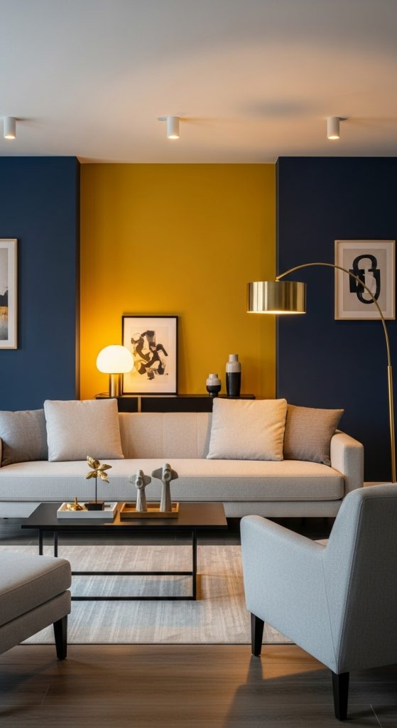
2. Navy Blue and Mustard Yellow
Navy blue and mustard yellow create a striking, energetic contrast. The deep richness of navy blue exudes sophistication, while mustard yellow adds warmth and vibrancy. This combination works perfectly in living rooms, dining areas, or home offices.
To use this scheme effectively, paint the larger walls navy blue and incorporate mustard yellow as an accent, either on one wall or through décor items like cushions, rugs, or artwork. This helps prevent the yellow from overpowering the space while keeping the room lively.
When preparing the walls, ensure a smooth base and consider a primer for darker blues to achieve even coverage. Accessories in metallics like gold or brass complement this palette beautifully. The combination balances boldness with elegance and allows creativity with textures, patterns, and furnishings. Navy and mustard create a modern, energetic ambiance without being too overwhelming, making it a popular choice for contemporary interiors.
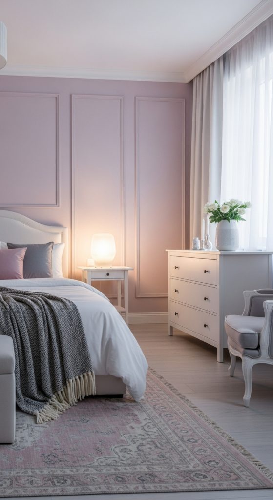
3. Soft Pink and Gray
Soft pink and gray is a gentle, elegant combination that adds warmth without being overpowering. Soft pink brings a calming, inviting feel, while gray adds sophistication and neutrality. This color pairing works well in bedrooms, nurseries, or cozy living spaces.
Use gray as the primary wall color and soft pink for accent walls or decorative features. Alternatively, soft pink on walls with gray furniture creates a balanced, stylish environment. Pastel tones of pink work best for larger spaces, while gray helps anchor the design, preventing the room from feeling overly sweet or feminine.
Proper wall preparation includes a smooth surface and a primer, especially if changing from darker shades. Soft fabrics, neutral décor, and subtle metallic accents enhance the palette. This combination conveys elegance and serenity, creating a space that is comfortable and visually appealing. Soft pink and gray together offer a timeless, chic aesthetic that complements modern and traditional interiors.
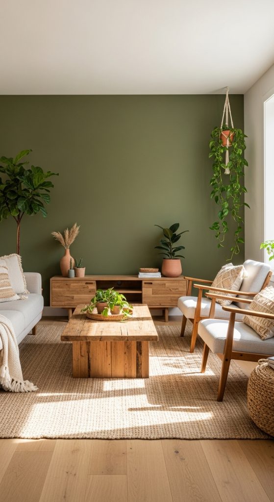
4. Beige and Olive Green
Beige and olive green combine earthy tones to create a natural, calming environment. Beige provides a warm, neutral base, while olive green adds depth and subtle color. This combination is ideal for living rooms, kitchens, and bedrooms where a relaxed, organic feel is desired.
To implement this palette, paint the majority of the walls beige and use olive green on a feature wall or in furniture and décor elements. This helps create visual interest without making the room feel dark. Textured finishes or natural materials like wood complement the colors beautifully.
Wall preparation is important; smooth walls with a primer ensure even coverage. This palette works well with natural light, and adding indoor plants enhances the natural, serene ambiance. Beige and olive green create a harmonious, grounded space that feels cozy, sophisticated, and timeless.
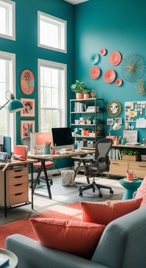
5. Teal and Coral
Teal and coral are a vibrant, lively combination that injects personality into any room. Teal’s rich, calming undertone balances the warm, energetic tone of coral. This pairing is perfect for accent walls, bathrooms, or creative workspaces.
Teal is best used as the dominant color on walls, while coral accents can appear in furniture, artwork, or smaller wall areas. This helps avoid overwhelming the space while still creating a cheerful, stylish look.
Preparing walls involves smoothing surfaces and applying primer for bold colors. Pairing this combination with neutral furniture and natural textures enhances balance. Teal and coral evoke energy, creativity, and sophistication, making rooms feel modern and inviting. It’s a bold choice that still maintains harmony when used thoughtfully.
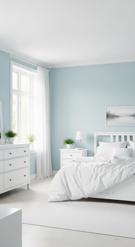
6. Light Blue and White
Light blue and white is a classic combination that brings tranquility and freshness to a room. Light blue has a calming, spacious effect, while white brightens the space and keeps it airy. This pairing is ideal for bedrooms, bathrooms, or study areas.
For the best effect, paint walls light blue and use white for trim, ceilings, or furniture. This contrast enhances the feeling of openness and light. Light blue works well with both natural and artificial light, creating a soothing environment that promotes relaxation.
Proper preparation includes cleaning walls and applying a primer for even color coverage. Accessories in soft neutrals or pastels complement the palette. Light blue and white provide a serene, timeless look, perfect for rooms that need to feel refreshing and uncluttered.
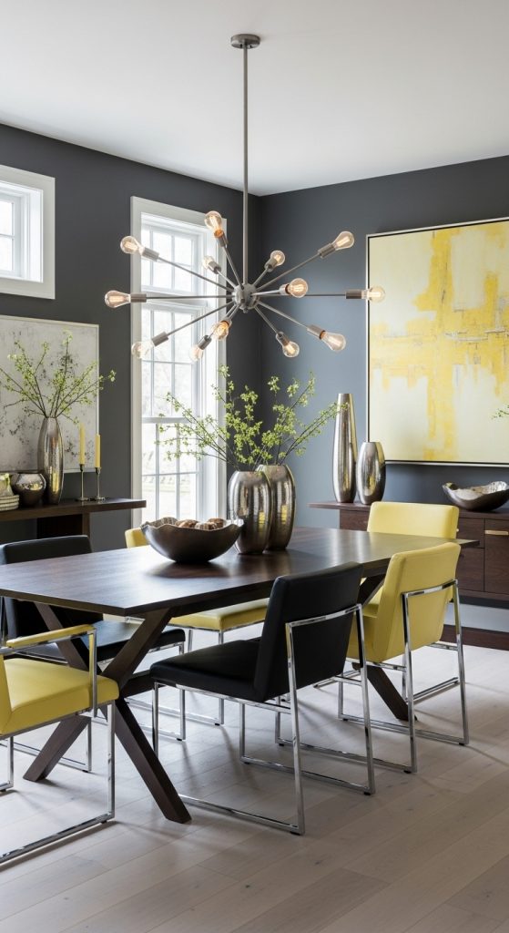
7. Charcoal and Soft Yellow
Charcoal and soft yellow create a modern, balanced contrast. Charcoal gray adds sophistication and depth, while soft yellow introduces warmth and cheerfulness. This combination works well in living rooms, kitchens, and bedrooms for a contemporary aesthetic.
Use charcoal on larger walls or as an accent, paired with soft yellow to highlight architectural features, furniture, or décor. This keeps the room visually appealing without making it dark.
Wall preparation includes priming and smoothing surfaces for even color application. Metallic accents, natural wood, and neutral décor enhance this palette. Charcoal and soft yellow combine elegance with energy, providing a versatile scheme suitable for both modern and transitional interiors.
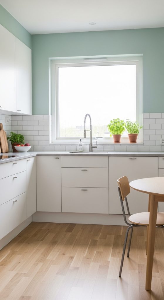
8. Mint Green and White
Mint green and white is a fresh, lively combination that brings a sense of renewal to any space. Mint green has a light, airy feel, while white ensures brightness and clarity. This pairing works wonderfully in kitchens, bathrooms, or home offices.
For balance, paint the walls mint green and use white for trims, ceilings, and furniture. This combination feels clean, cheerful, and visually spacious. Mint green can also be used as an accent on one wall for subtle freshness.
Preparation involves priming and smoothing walls to prevent uneven tones. Complementary décor in light wood, natural fibers, or neutral shades enhances the overall aesthetic. Mint green and white create a refreshing, inviting space that feels calm, vibrant, and modern.
9. Taupe and Cream
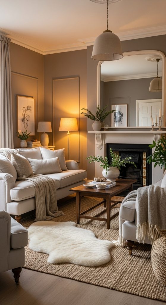
Taupe and cream is a warm, versatile combination that brings subtle elegance to any room. Taupe provides a grounded, neutral backdrop, while cream adds softness and light. This palette works well in living rooms, dining rooms, and bedrooms.
Use taupe for main walls and cream for trims, ceilings, or accent features. Adding soft fabrics and textured décor enhances the cozy, sophisticated feel. This color combination creates depth without overwhelming the senses, making it ideal for both small and large spaces.
Wall preparation is essential for smooth, even application. Taupe and cream pair well with metallic accents, wood tones, and natural elements, creating a timeless, elegant interior. This scheme is perfect for those who prefer a subtle, refined look over bold color contrasts.
10. Deep Purple and Silver
Deep purple and silver create a luxurious, dramatic atmosphere. Deep purple is rich and bold, while silver adds elegance and brightness. This combination is ideal for bedrooms, dining rooms, or feature walls that need a sophisticated, modern touch.
Apply deep purple to one or two walls and use silver for trims, décor, or accents. This maintains balance and prevents the space from feeling heavy. Metallic finishes and reflective surfaces enhance the elegance of this palette.
Preparation involves smoothing and priming walls for the deep color. Pairing this combination with neutral furniture or soft textures prevents overwhelming the senses. Deep purple and silver together create a glamorous, stylish interior with a sense of depth, luxury, and visual interest.
