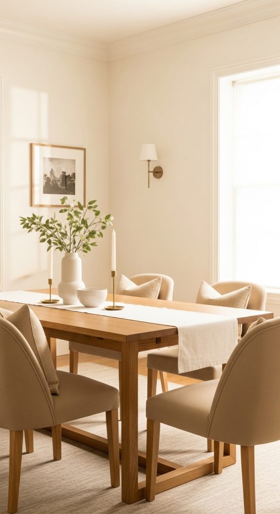
Creating a beautiful, calming, and versatile interior space often starts with selecting the right color palette. Neutral colors are timeless, adaptable, and can create a soothing atmosphere in any room. Unlike bold or bright colors, neutrals allow flexibility in furniture, décor, and accessories. They provide a subtle backdrop that can enhance architectural features, lighting, and textures, making spaces feel larger, cleaner, and more inviting.
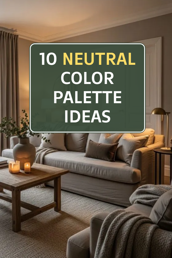
Neutral palettes are not just about beige or white; they include soft shades of gray, taupe, cream, greige, and even muted pastels that blend seamlessly. Choosing the right neutral colors can also help set the mood of a room, whether you aim for warmth, coolness, or elegance. Neutral tones are ideal for minimalistic designs, modern interiors, and even eclectic styles because they allow decorative elements to shine without overpowering the space.
Before applying neutral colors, it’s important to consider the room’s natural light, furniture style, and flooring. The goal is to create harmony and balance, ensuring each shade complements the other. Here are ten neutral color palette ideas to inspire your next home design project.
1. Classic Beige and Cream
A classic neutral palette combines beige and cream to create a warm, timeless look. Beige brings subtle earthy tones, while cream adds lightness and brightness to the space. This combination works well in living rooms, bedrooms, and dining areas. For preparation, start by selecting paint samples and testing them on a small wall section to see how natural and artificial light affect the shades.
Materials that pair well with beige and cream include wood, rattan, linen, and soft fabrics like cotton or velvet. Accessories in muted gold or bronze can enhance the elegance of this palette. For flooring, natural hardwood or light-colored tiles complement this scheme beautifully. This palette is ideal for those who want a welcoming, cozy, and sophisticated environment without the risk of bold colors overwhelming the space.

2. Soft Gray and White
Soft gray and white create a sleek and modern neutral palette. Gray provides depth and sophistication, while white balances it with brightness and clarity. This combination is perfect for contemporary living spaces, kitchens, and bathrooms. Preparation involves choosing the right undertones of gray—cool grays suit modern designs, while warm grays create a homier feel.
Materials like glass, stainless steel, marble, and matte finishes enhance the modern look. Fabrics such as cotton and wool in soft textures soften the overall aesthetic. Soft gray and white allow for versatile accent colors, including muted blues, greens, or blush tones. This palette is excellent for creating a calm, clean, and airy environment.

3. Warm Taupe and Sand
Warm taupe and sand provide an earthy neutral palette that feels grounded and natural. Taupe combines the softness of gray with warm undertones, while sand evokes the subtle colors of nature. Before applying, test samples in different lighting, as taupe can appear cooler or warmer depending on light.
This palette works well in bedrooms and living areas where a calming environment is desired. Pair taupe and sand with natural wood furniture, linen textiles, and plants to bring life into the room. Accent elements in soft copper or terracotta enhance the warmth. The palette is ideal for creating a relaxing, nature-inspired home that feels comfortable and welcoming.

4. Greige Elegance
Greige, a blend of gray and beige, is a versatile and elegant neutral palette. It offers the sophistication of gray and the warmth of beige, making it suitable for almost any room. Preparation includes sampling multiple greige shades, as subtle differences can drastically change the room’s mood.
Furniture in light woods, stone countertops, and soft upholstery works well with greige. Metallic accents in brushed gold or nickel provide a refined touch. Greige is particularly effective in open-plan spaces as it blends easily with various textures and materials. This palette is perfect for homeowners seeking understated elegance with a modern twist.

5. Creamy White and Light Wood
A creamy white and light wood palette offers simplicity, warmth, and brightness. Creamy whites create a spacious feel, while light wood adds natural warmth and texture. Preparation includes selecting complementary shades that avoid stark contrast or yellow undertones in whites.
Use wooden furniture, bamboo accents, and soft cotton textiles to enhance the natural vibe. This palette is ideal for Scandinavian-inspired interiors, minimalist designs, and modern rustic homes. It emphasizes openness, simplicity, and a calm aesthetic that suits living rooms, kitchens, and bedrooms alike.

6. Soft Greys with Charcoal Accents
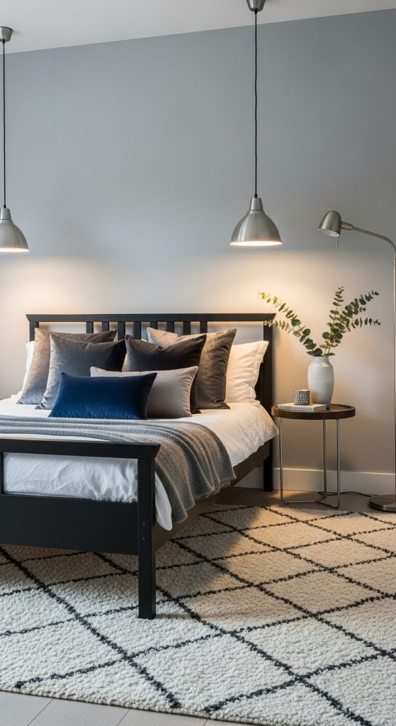
A neutral palette of soft gray with charcoal accents provides depth, contrast, and modern sophistication. Gray acts as a versatile backdrop, while charcoal introduces subtle drama without overpowering the room. Preparation involves selecting gray tones with the right undertones to harmonize with your furniture and décor.
Textured materials like wool, velvet, or brushed metals complement this palette. Charcoal accents can be added through furniture, throw pillows, rugs, or artwork. Ideal for offices, bedrooms, and living rooms, this palette balances calmness with style and can be paired with soft pastel accents for added dimension.
7. Beige, White, and Warm Wood
Combining beige, white, and warm wood creates a balanced, inviting neutral palette. Beige adds softness, white brightens the space, and warm wood brings texture and grounding. Preparation includes checking how wood tones complement wall colors and choosing a balance that feels harmonious.
This palette works well in living rooms, bedrooms, and kitchens. Linen curtains, cotton cushions, and wooden furniture pieces enhance the aesthetic. Warm metallics like brass or bronze can be used as accents. This combination is ideal for a cozy yet sophisticated environment that blends traditional and modern elements.

8. Soft Taupe and Muted Green
Soft taupe paired with muted green creates a neutral palette inspired by nature. Taupe acts as a warm base, while muted green adds a subtle organic touch. Preparation involves testing paint colors with room lighting, as taupe can shift undertones.
Natural materials like rattan, linen, and wood work beautifully with this palette. Plants and botanical décor pieces enhance the natural feel. This palette is perfect for bedrooms, home offices, or living rooms where a peaceful, grounded ambiance is desired.

9. Warm Gray and Soft Beige
Warm gray combined with soft beige offers a cozy, understated neutral palette. Warm gray adds depth without feeling cold, and soft beige introduces warmth and comfort. Preparation includes selecting the right undertones to prevent the room from looking too muted or dull.
Pair this palette with natural textiles, soft rugs, and wooden furniture for an inviting feel. Metallic accents in muted gold or bronze add elegance. This palette works well in spaces where a comfortable, welcoming environment is essential, such as living rooms and master bedrooms.

10. Ivory and Soft Sand
An ivory and soft sand palette creates a serene, timeless neutral combination. Ivory provides light and brightness, while soft sand adds warmth and subtle depth. Preparation includes testing paint samples in natural light and layering textures for added dimension.
Materials like cotton, linen, wool, and natural wood complement this palette. Soft throws, rugs, and cushions in neutral tones enhance comfort. This combination works in bedrooms, living rooms, and dining areas to create a peaceful, airy, and elegant environment suitable for a variety of interior styles.